
Clarity from the Inside-Out
For professional service providers and growing businesses who need more than tactics. We uncover what truly resonates with your buyers then integrate branding, website design, and digital strategy into one cohesive system.
Trusted by
The Inside-Out Process In Action
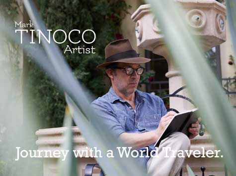
View Website (sacredspacegardendesign.com)
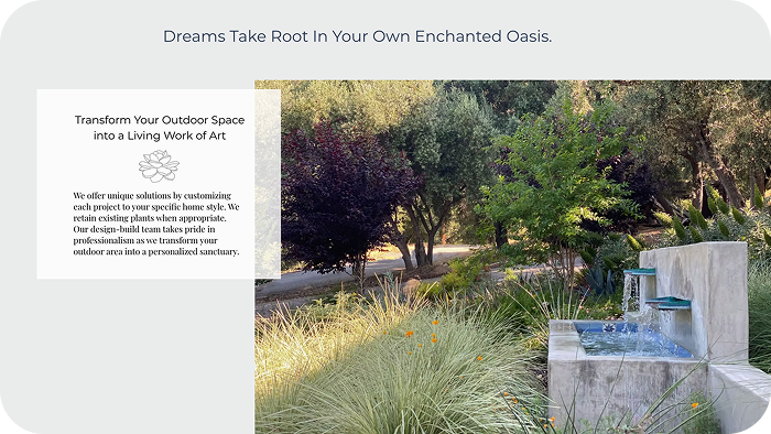
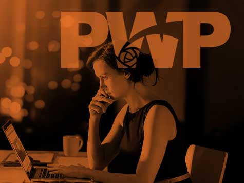
The Problem
People came to Sacred Space knowing they wanted a beautiful result. But the old website didn’t explain what the process would look like, how much time and effort it would take, or if the company really understood their home and lifestyle.
The Solution
The Inside-Out Process showed us that clients aren’t just looking for landscaping. They want peace of mind and a single, trusted contact from the first sketch to the last stone. We made that promise central to everything we do. One designer. One relationship. A garden designed for the way you really live outdoors.
The Inside-Out Difference


We Go Where Most Agencies Won't
Most branding and digital marketing firms begin with what a business looks like to the outside world. They start with a logo, a color palette, or a campaign and then try to make everything else support that first impression.
Green Street works in the other direction. We begin at the beginning. That means talking to your actual buyers before designing anything. It means understanding your organization's genuine purpose before writing a single word of copy.
Only after that foundation is solid do we move forward into positioning, strategy, and finally the creative work that the world sees. The result is a brand that holds together because every visible element was built on something real.
How We Work
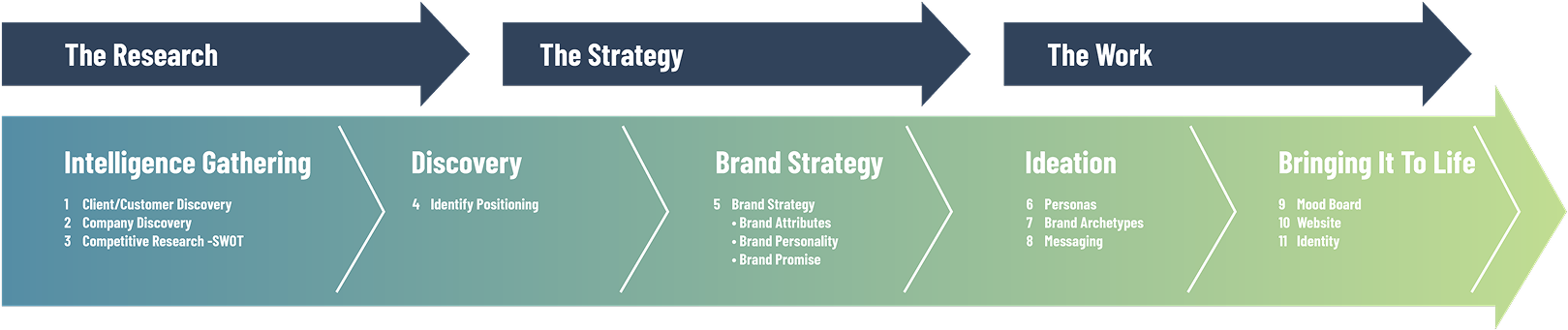
The Inside-Out Process
An 11-stage methodology built in three phases. We gather what is true, shape it into strategy, then bring it to life across every touchpoint.

About John Espinoza
I’ve Spent Four Decades Looking at Design From Every Angle.

In the first half of my career, I worked as an Art Director for brands you probably know: Kraft, Nestlé, Hilton Hotels, Lockheed, Ford, Honda, and Disney. These were big brands with big budgets and high expectations.
Later, I wanted to bring that same design thinking to people who needed it most but rarely had access to it. I started working with professional service firms, ambitious founders, and growing companies who knew their work was excellent but needed the world to notice.
Art Center College of Design
I graduated from Art Center and taught there for fifteen years. My training focused on concept-driven design and strong visual communication.
20 Years in Enterprise Branding
I use my Fortune 500 experience to help companies that truly need it, not just those with the biggest names.
HubSpot Certified Solutions Partner
I’m certified in digital marketing, which gives us the technical foundation for effective lead generation and reporting.
Integration Specialist
Here, branding, website design, and digital marketing strategy all work together. You no longer have to juggle separate teams and hope they communicate.
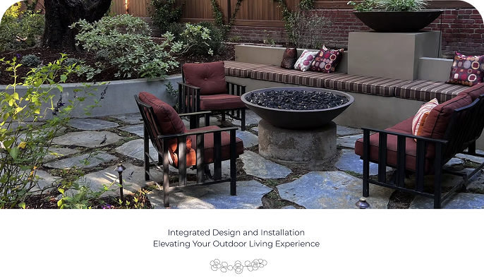
Selected Work
Brands Built From The Inside Out


“I have worked with many agencies during my career and you have been an outstanding partner. Even in challenging times Green Street Ads supported our company and dealt with the issues extremely professionally and fair.”
– Holger Altvater, VP Marketing , Top 3PL Company
Who We Work With
This Work Is For a Specific Kind of Business Owner
An 11-stage methodology built in three phases. We gather what is true, shape it into strategy, then bring it to life across every touchpoint.
Professional service providers between 1 and 5 million in revenue who are ready for brand-level thinking without a large agency price tag
B2B manufacturer, logistics company with complex and long sales cycles where multiple stakeholders evaluate you
Founders with previous experience who understand the value of getting the strategy right before investing in execution
Companies that have outgrown their current brand and need everything aligned before the next phase of growth
Leaders who want to be collaborative and are ready to share what they know about their own buyers
“It starts with knowing your buyer. Everything else follows from there.”
— John Espinoza,
Founder of Green Street Digital Marketing
20 Years Building Brands.
20 Years Understanding Buyers.

Digital Marketing Mastery
HubSpot Certified Solutions Provider

Fortune 500 and B2B Experience
Art Director for Kraft, Nestlé, Hilton, Ford, Honda, Disney. B2B clients in logistics, manufacturing, professional services

Design Education & Teaching
Art Center College of Design graduate and instructor for 15 years
Let's Find Out What Your Buyers
Actually Need to Hear
We start with a conversation. A free review of your current digital marketing, brand, or website. No pitch. Just a clear picture of what is working and what could work harder.

© 2026 Green Street Digital Marketing. Green Street serves the small to medium size businesses in Pasadena, Glendale, Burbank, and businesses nationally.

